
Various Clients / Branding, Creative


Various Projects / Clients
1. Brunners Metal Works
Role: Brand Strategy, Creative Direction, Graphic Design & Print Advertising
Project Overview
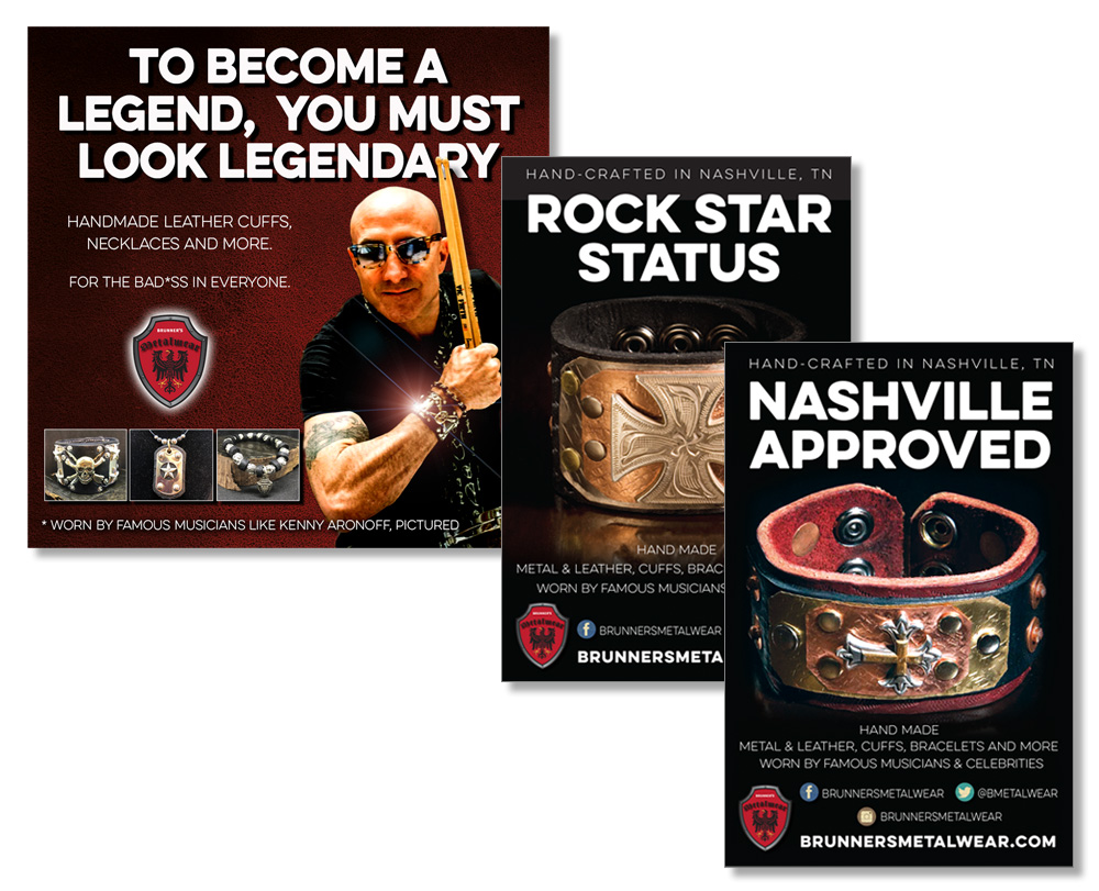
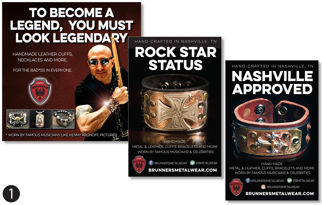
Brunners Metal Works creates handcrafted leather and metal accessories inspired by rock-and-roll culture. The challenge was to develop a bold, distinctive visual identity that captured the rebellious spirit of the brand while connecting with its niche audience of musicians and music enthusiasts.
Drawing inspiration from the products themselves and photographs of well-known musicians wearing them, I developed an edgy, high-impact advertising campaign that positioned Brunners as more than an accessories brand—it was a way to embrace the rock-star lifestyle.
Through dramatic product photography, bold typography, and attention-grabbing messaging, I created a cohesive series of posters, flyers, and direct mail pieces designed to build brand recognition, showcase the craftsmanship, and inspire customers to make a statement of their own.
2. Arsenal Athletic Training
Role: Brand Strategy, Logo Design, Graphic Design, Apparel Design & Social Media Marketing
Project Overview
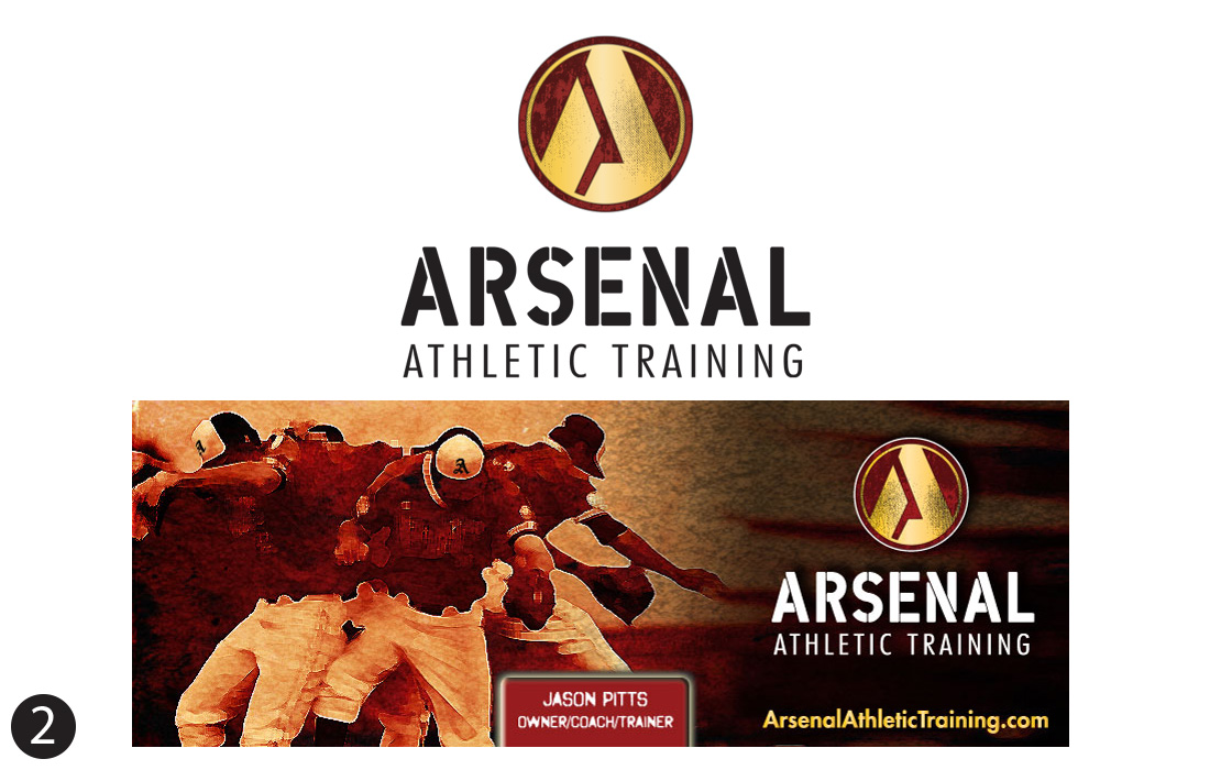
Arsenal Athletic Training was a Charlotte, North Carolina-based training facility dedicated to helping young baseball players develop their skills and reach their full athletic potential. The goal was to create a bold, recognizable brand identity that reflected the facility's focus on strength, discipline, and competitive excellence.
I developed a distinctive logo featuring a strong, military-inspired design that reinforced the Arsenal name and conveyed a sense of power, determination, and teamwork. The bold typography and striking red-and-gold color palette helped establish a memorable visual identity that would resonate with young athletes and their families.
Building on this identity, I created custom T-shirt designs, promotional graphics, and social media marketing materials that maintained a consistent brand presence across multiple platforms. The result was a cohesive visual brand that captured the energy of competitive baseball while helping Arsenal Athletic Training establish its identity in the Charlotte youth sports market.
3. Ricky Young - Country Music Artist
Role: Brand Strategy, Creative Direction, Logo Design, Graphic Design, Merchandise Design, Website Graphics & Print Advertising
Project Overview
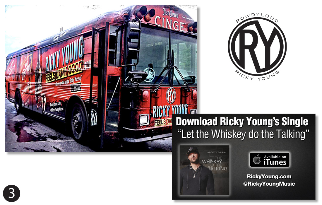
Country music artist Ricky Young needed a distinctive, cohesive brand identity that captured his personality, musical style, and growing presence in the country music industry. The goal was to create a recognizable visual brand that would connect with fans while maintaining consistency across everything from album artwork and promotional materials to merchandise and touring vehicles.
I developed a comprehensive visual identity centered around a custom-designed logo that reflected Ricky's authentic, modern country music style. Building on that foundation, I created an extensive collection of marketing materials, including album covers, concert posters, promotional graphics, branded merchandise, website artwork, and a full-size tour bus wrap that transformed his vehicle into a traveling billboard.
Each element was designed to reinforce Ricky's identity, promote his music, and create a consistent visual experience across print, digital, and live-event environments. The result was a unified brand presence that helped Ricky stand out in a competitive music industry while connecting with audiences both on and off the stage.
4. EōS Fitness
Role: Graphic Design, Print Advertising & Marketing Collateral
Project Overview
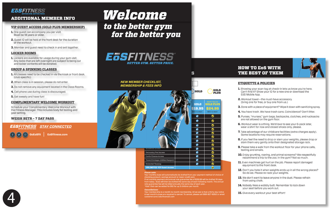
EōS Fitness, a national fitness center chain, needed a professionally designed brochure to introduce prospective members to its facilities, membership options, and amenities. The objective was to create an engaging, informative piece that communicated the brand's value while making essential membership information easy to understand.
Working within the company's established brand identity, I designed a visually compelling brochure that incorporated bold typography, energetic fitness imagery, and the brand's signature color palette. The layout balanced promotional messaging with detailed membership information, creating a clean, organized presentation that was both attractive and functional.
The finished brochure provided EōS Fitness with a polished marketing piece designed to communicate membership benefits, reinforce brand consistency, and support the new-member enrollment experience.


